Banks Rice Company Logo Design
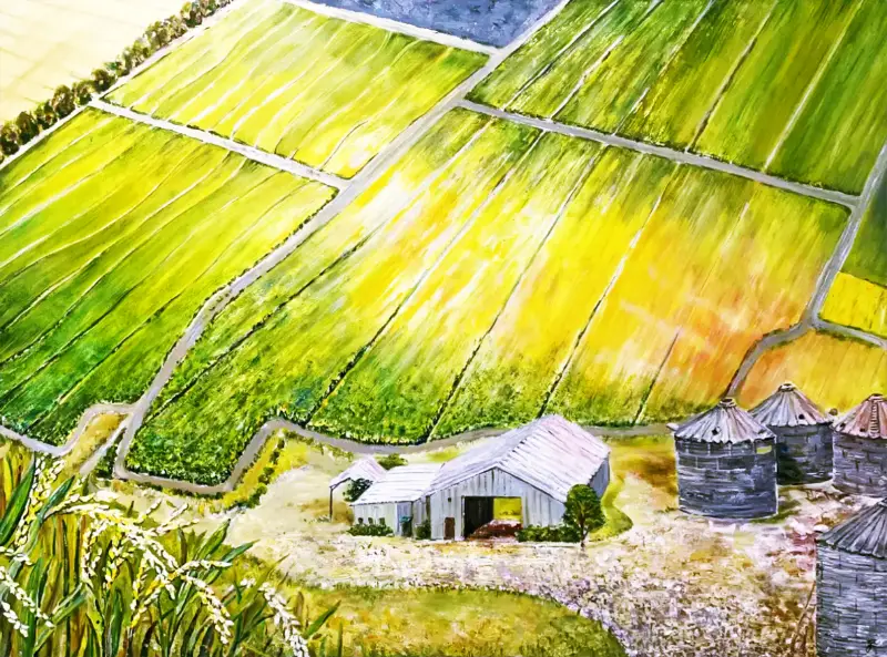
The Banks Rice Company logo design is a project that integrates both vector graphics and bitmap graphcs for a great brand design. We were contacted by Banks Rice to produce a new logo and brand design for their rice product and packaging. It was fun to brainstorm on ideas immediately, however they wanted to integrate some elements of a painting that was personal to the owners.
“The fun and challenging part of working on a logo is brainstorming and sketching ideas first on paper or screen.”
When ever working on a company logo design, brainstorming and sketching helps define the roadmap “Where are we going“. Whatever the project is, one of the methods to get the mind flowing with creativity is to make a pasteboard pr sketch board. This can be digital such as in a paint or illustration program, or on paper.
The Banks Rice Company logo design project quickly started with some paper sketches but let’s look at what we are working with and what is most important to the client.
Banks Rice Company Logo Design Goals for Banks Rice
- Clean design with strong brand identity
- Easily identify with farming
- Consider how the logo works with packaging
- Use the painting or elements from the painting
First Draft Logo Designs
We usually prefer to provode at least three designs for each company logo design client. This helps narrow down the logo direction and branding colors. Narrowing the design target is essential and must be something the client will love, speaks to the brand identity or product use, and their target audience.
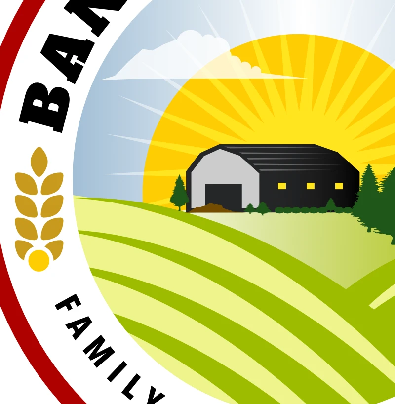
You can see in the first image, flat vectors were not ideal but would be a good foundation to build upon with integrated graphics from the painting. Plus, the vector graphics would provide options to make sure the client knows what that might look like if the painting was too detailed, or client decided to go in another direction.
We started outlining the barn and rice silos and clipped them from the paiting. This allowed us to be able to position them in any place on the logo canvas, get the angles right and adjust contrast.
Fine-Tuning The Logo Designs
The merge of vector and painting coming together as one. Logo taking shape retaining the original painting and the added colors, wraped in retangular shape makes it easy for eye poping identiy and packaging.
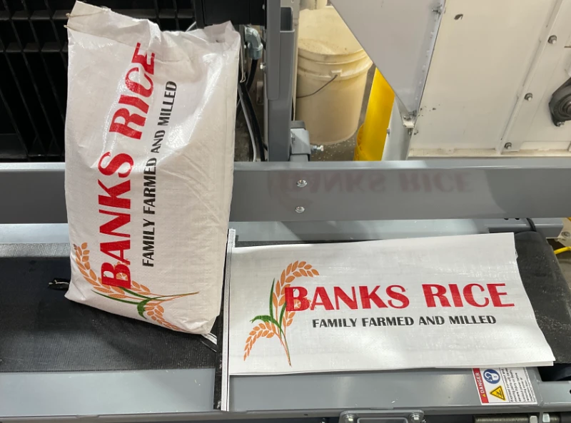
The Final Logo
The final logo is something that not only we are happy with, but the client is happy with too! That’s a win and the company logo design works well for their new brand identity. The logo connects with the prodcut, with warm colors. In hindsight, the painting gives a personal feel to the logo. We are glad the painting worked it’s way into the logo as well as it did.
In closing
Every logo design project has it’s unique challenges. Sometimes it comes naturally and sometimes it doesn’t. However, following some best practices of design. 1: knowing what the client is wanting. 2: allowing time to brainstorm by hand or digitally can make a huge difference. 3: Broaden your horizon by doing research online with free sites like unsplash, pexels and paid sites like Canva, Vecteezy with help get a handle on how far the ideas take shape.
If you are looking for someone to help you with a new logo design or refreshing an exsisting logo, contact us and let our team help you get the logo you want. We can also help you with graphic design, website design and printing materials.