What Color Is That? This Might Help!
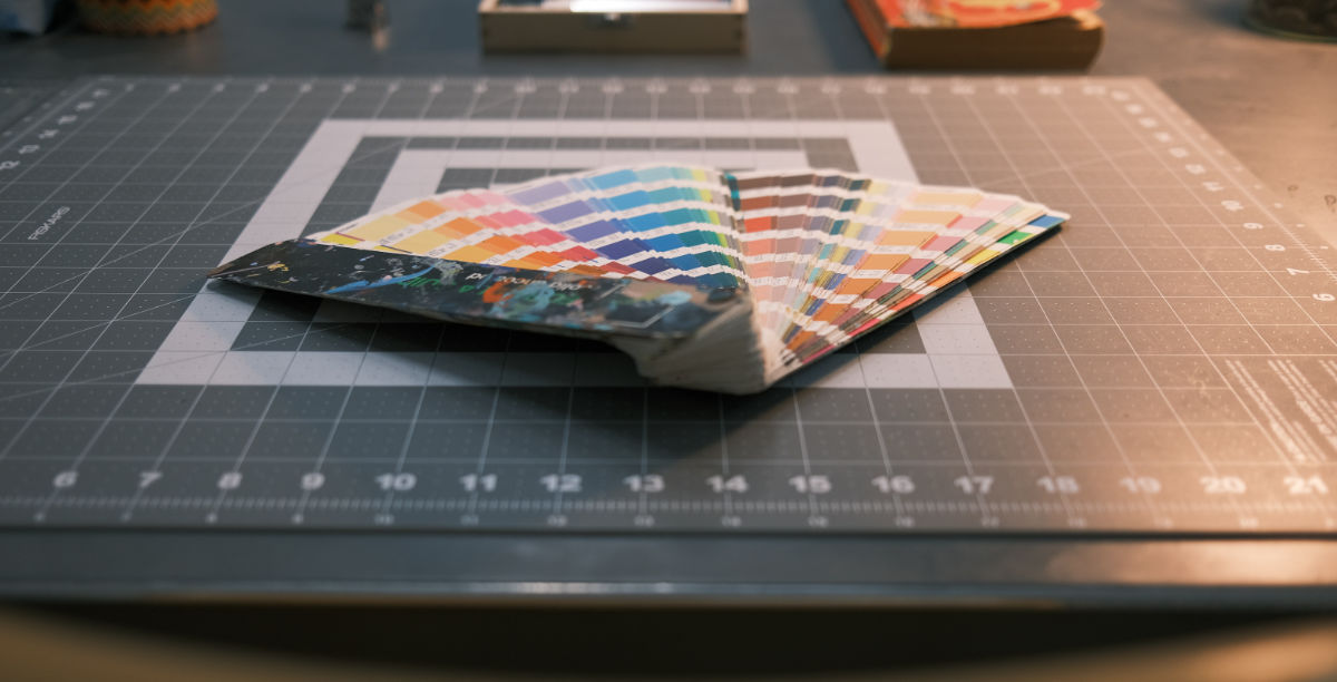
Sometimes colors just needs to be specific. Especially when it comes to branding. Back in the early days of graphic design publishing and printing, most of us creatives used a Pantone Color Book.
If you’ve ever had someone vaguely tell you something along the lines of: “just use a standard blue”? I can’t tell you how many times I hear: dark blue, navy blue, or whatever color. This is exactly why I wrote this post. Colors are unique to deisngers in the sense that there’s more going on than just pigment.
Consider: there are flat colors, reflective colors, metallics and gradients just to name a few. Getting color right is essential to the world around us especially when it comes to graphics and brand design.
Colors aslo set a feeling, or mood, or a tone. Why is Coke red? Would you drink it if the packaging was orange? Brand designers put a lot of time an effors into choosing colors on design boards when presenting their work. When a client has a speciffic idea about color but no absolute refrence number, I’ve learned after many years of graphic design and logo projects to make it easier by using a color guide.
The solution to the color problem
There are three main branches of color: RGB (Red Green Blue) CMYK used in offset printing (cyan, yellow magenta, black) and WEB hex color (example: #46A6B6)
Does anyone in the graphic design, pre-press or printing industry remember those “PMS” Pantone Color Matching System colors?
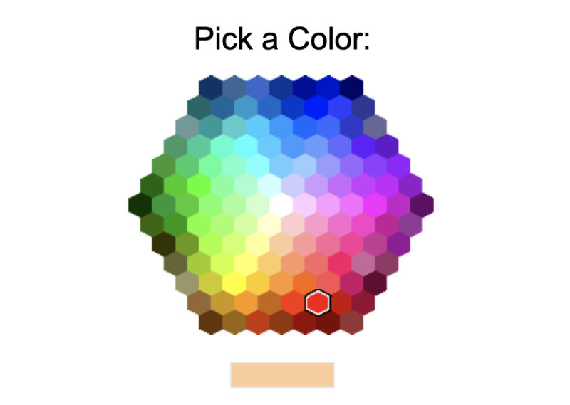
Times have changed and with the growth of the web there are some useful tools that can help define your color tastes exactly how you see them.
Check out these easy to use web based color pickers for just about any project.
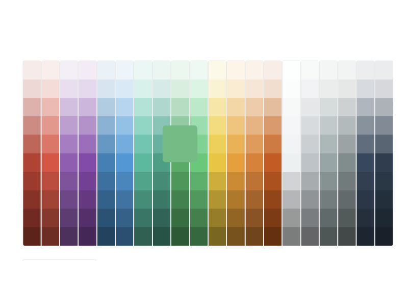
- HTML Color Codes is a very easy to use:
https://htmlcolorcodes.com/color-chart/
- W3 Schools Color Podes is a great refrence:
https://www.w3schools.com/colors/colors_picker.asp
TIP: Display settings can have an effect on how color is perceived.
Choosing colors on the web is very easy. Just be aware that everyone has different display resoulutions and settings. Your screen settings have an effect on the how the colors your eyes interpret. For example, if you are using an extreme contrast or brightness setting, the colors very well could be different on somone else’s screen.
Also note that some LCD screens represent colors differently from different vertical angles. It is best praxtice to sit in front of the scren with the center at eye level or just slightly lower.
Photo Credits: https://unsplash.com/@johnmrodriguez and https://unsplash.com/@davidpisnoy